
The masthead of the magazine is placed at the top right of the cover, the font size and colour stands out from the background therefore this helps capture the audiences attention. The main cover line is in a suitable font for viewers to read and is a bright colour to also capture attention. The main image on the page shows that the school uniform matches the colour of the masthead, this shows they were careful about which colours went and which didn't.

The masthead of the magazine is placed at the top of the page slightly more to the left rather than the middle. The white colour of the font stands out as it's sat on a blue sky. The image is also the background, using a picture of a school and having the masthead as school is a very good combination and well thought out. The yellow writing of the cover line on the green grass stands out very well to catch the audiences attention.

The masthead of this magazine is positioned at the top right of the magazine cover, the writing and font are large and noticable to read for the viewers. The image is a mid shot in the centre of the magazine tilting slightly to the left. An image this big can capture peoples attention very well. The cover line is a couple of inches below the masthead and is white against a blue background, therefore the coverline stands out.
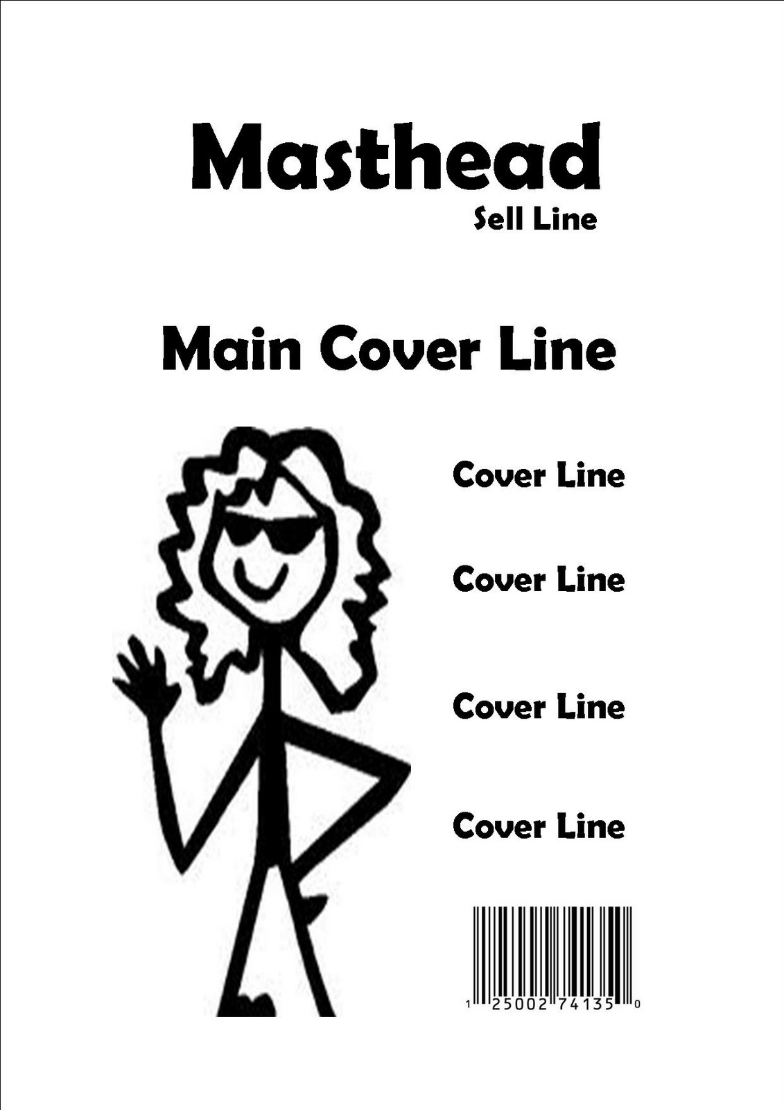
The masthead is positioned at the centre/top of the page, the font is quite large and easy to read. The image is a midshot at the left hand side of the page. The image is large therefore stands out for people to spot. The main cover line sits just above the image in the centre and is also large therefore again will catch attention. The smaller cover lines are in a list going down the side of the image. This is easy to read as they are not dotted around the page. The barcode is just below the last cover line at the bottom right of the page.

The masthead name has been changed to Rumours. The sell line is called Monkseaton's Finest as the magazine is about that particular school. There are four cover lines, the main cover lines is in big bold writing above the picture telling us that 'rumour has it that the sixth form area is changing'. The other three cover lines are just little information that don't really matter as much as the main cover line.

Original image taken to be on the front of the magazine. Mid shot of a superb student.

This is four designs of the magazine. The top left was actually selected to be the front covert of the magazine as it's easy for the coverlines and pictures etc.

This is some ideas of how the photograph of the student will be like. It explains what they are doing, what type of shot it is and also if they are holding some sort of object or not.

The final photo design of the student. The photo has been cropped, it faces the oppocite way and the background has been played with to make it more obvious for a magazine.

This is the final piece for the school magazine. The masthead is centered slightly over to the right, most school magazines have their masthead on the very right or very left. I have went for something slightly different. As normal the sell line is below the masthead. The midshot of the student is now the total background as a small picture looked a bit wrong with a white background. The main cover line has been changed and put in the centre of the left hand side of the page and I did not want to cover up Emily's face on the photo. The other coverlines are different sized fonts as I didn't want them to be exactly the same and people concentrate on the bigger coverlines. I've spread the coverlines out because they were too clogged together. They look more free now. Also the bar code has stayed the same size and in the same place as the other designs as it looks alright where it is.

This contents page doesn't say 'Contents page' but it does have the title of the magazine which is Student. The background photo is of a school note book. This is very clever as it shows even more how it's a school magazine. The numbers of the storys in the magazine are dotted all over the page, in different angles. This proves it's not boring. The other objects in the picture make it look sophisitcated.

This contents page is very good the way the pictures down the side aer presented in their slant ways. Also the picture as the background shows that its about the school and nothing else. The word contents is at the centre at the top of the page in red, this catches the eye and let's people know that they have reached the contents page.

The contents page is very simple. The writing would be bigger and better! The title and the contents page are slanted at the top left hand corner to make the school magazine a little funky. All the other writing is the right way up. There are no pictures on this page as people should concentrate on whats going on in the magazine and the pages to find them on.
