Friday 15 April 2011

Evaluation

In what ways does your media product use, develop or challenge forms and conventions of real media products? 

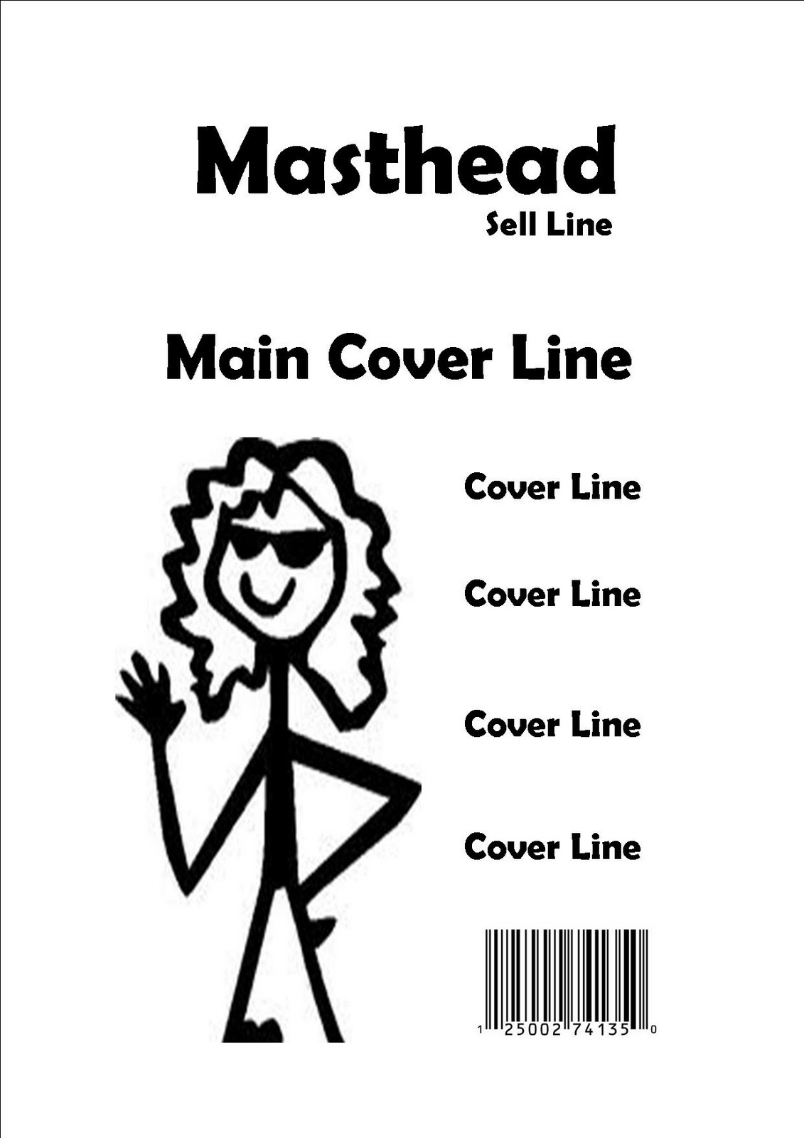
I did my research on other popular indie/rock magazine. The ideas I chose from them were things such as, having the masthead in the top left hand side of the cover. Most magazines do this as it looks unusual to have it anywhere else. Another idea was having the main cover line sitting directly infront of the picture to show people that they are linked. If the cover line was in another place people might mistake it for something else.
 
Another idea was on the contents page, where there is not a lot of details about less important things in the magazine. The contents page only focuses on the main features, therefore people don't have to look at things that they don't need to. I only used three pictures on my contents page, from my research some magazines don't have pictures at all or only have a few. Other magazines had loads of pictures on their contents page but I thought it looked a bit much. Again I put the title contents in the top left hand corner of the page just like any other magazine would. I also used the same fonts and colours to make them match and to prove that they are featuring in the same magazine. I placed the pictures next to headings that they are featured in. For example there is a heading that says 'The Cutouts win surface festival, and next to that heading is a picture of the band 'The Cutouts'. I thought this would be useful to people and show them who some of the band/solo artists are and what they look like. I also took another idea for the contents page and that was to advertise a competition to win tickets to some great gigs and concerts. The fonts for the headings I used were the same every time. In professional music magazines the headings and sub headings are always in the same font to show to viewers that these are all connected.
On the double page spread I used a lot of ideas from other magazines such as having one giant photo taking up one of the pages. A quote was placed infront of picture, some magazines do this to show to viewers what gets said in the magazine. If it's an eye catching quote then that makes the audience want to read on and see why they said what they did. At the top of the second page of the article there is the name Ruby Daze in large writing. This informs readers that the article is about that person. Also the font is like a trade mark to the artist. I added a small paragraph that will then lead onto the interview. Magazines do this to give you  an inside of what is going to be talked about in the article. I used columns in my article as it's the easiest way for readers to follow. Last of all on the double page spread three pictures sit at the bottom of the page. They are the same size and are of the same person. This is an idea of a magazine as pictures don't always need to be so big.

How does your media product represent particular social groups?

When I designed my media product I focused on a particular target audience. The age was 14+ and the particular genre of music people were interested in was indie/rock alternative. Therefore my magazine was represted for both male and female. I used a female artist on the front cover and on the double page spread therefore the magazine mainly focused on women.
I didn't focus on ethnicity as I didn't really think about how it would affect the readers. Using a white model does not exclude out any race. It just simply means that the model I chose was the first person I approached to do the photo shoot.
Nor did I focus on disability. I wanted my magazine to look like another professional music magazine such as NME. Music magazines don't normally have people with a disability in them as no one in the music industry are disabled. Not having a person with a disability on the front of the magazine doesn't stop someone with a disability from buying it. It just means that wasn't the look they were really going for.
Sexuality didn't seem important to deal with. People who buy the magazine can be of any sexuality they want. There is no rule to say that just because they are for example gay that they can't buy the magazine.
I focused on age more than anything else as a 60 year old person would not really want to read a magazine like this. So I focused more on the younger generation.

What kind of media institution might distribute your media product and why?

After looking at and reading through the websites I have come to a conclusion that Bauer Media would advertise my magazine. The reason why I think that this particular website would distribute Blur is because Bauer Media mainly focuses on representing and distributing music related magazines. This media distributer is responsible for the very famous 'Kerrang'. Kerrang was one of the magazines I focused on getting inspiration off. As my magazine is exrememly similar to Kerrang I most likely thought that Bauer Media would be quite happy to distribute a indie/rock alternative magazine.

Who would be the audience for your media product?/How did you attract/address your audience?

The audience for my media product would be people from the age of 14 onwards who like music in the genre of indie/rock-alternative. After analysing my front cover I decided that no one outisde of the specific genre of indie/rock-alternative would actually like the magazine. On my front cover to attract the particlar audience I wanted I used cover lines that included bands and events that the specific target audience would know. For example I used the band The Cutouts and the event Surface festival. I also used another popular event called The Split Festival. These would attract the specific target audience straight away.
On my contents page to attract peoples attention I used popluar bands in the features and news such as The Wombats, Muse, Blink 182 and Thriving Ivory. I also used a picture of a new band that would catch the audience's eye. Attracting a target audience can be tricky, so I even thought of using specific fonts to see if that will catch their eye too.
On the double page spread I used a quote 'Music is my religion'. People who love music would most likely want to read on after reading the quote. Also articles and interviews get interesting when they are about music therefore people in a specific target audience would be happy to read about music.

What have you learnt about technologies from the process of constructing this product?

From starting Media in sixth form I have learnt a lot. For starters I didn't really know how to make an image better on macromedia fireworks but after playing around with some images for my magazine I now know how to make pictures look professional. I already knew how to work a camera but I never used to pay attention about the lighting and posing. Now I know how to take a decent picture as I know that such as the glare on cameras is not good at all. Also When taking a close up, I know that the image would look terrible if the model is in a bad position.
I know how to create a double page spread using publisher. I've never done that before, for example putting the article into columns and adjusting pictures and words to make the whole page look better. Also on the bottom of the article I made the three small photos look better than what they were as I grouped them and made a border around each photo. Therefore they look connected.

Music Magazine Double-Page Article Audience Feedback


After finishing the contents page I presented it to the two volunteered target audience. I asked them four questions about the double page article, this was what they answered with.

What do you think of the colour scheme used?

Holly: I like the different shades of blue as it continues from both the front cover and the contents page. Also the way Blur talking is done in dark blue and Ruby Daze talking is done in light blue.

Emily: The blue goes really well with the large black and white photo. It makes both the photo and article stand out.

What do you think of the pictures used?

Holly: I like how the black and white photo is the main one and how it fills a full page. Also I do like how the other three pictures are all the same size and are sitting nicely next to each other.

Emily: The way the pictures have been positioned gives the magazine a professional look. The black and white image is my favorite as you don't normally see black and white images as the large, main photo.

What do you think of the layout?

Holly: The layout looks like it has been professionally done. The way the writing is in columns and is different colours when each person speaks is a excellent idea as it helps the reader understand what is going on.

Emily: I think the way the picture is on one side and the writing is on another gives it that professional look to how magazine articles should be. I like the way the three smaller pictures sit under the columns instead of over lapping them.

What was your first impression of the double page article?

Holly: My first impression was how professional I thought it looked. The colour scheme caught mu eye straight away. The blue stands out so much against the black and white photo.

Emily: My first impression of the article was I loved it how there was a lot of shades of blue and how the pictures go together so well.

I then asked the chosen target audience to give me two good points and two bad points about the magazine. Here's what they came up with.

Holly:
  • The blue colour scheme goes together really well with the black and white photo.
  • The fonts look like they have been thought of carefully as they don't clash.
  • There could have been more writing in the article.
  • The little pictures at the bottom of the page should have a description.
Emily:
  • The text is easy to read, therefore it's not difficult to follow.
  • The introduction paragraph isn't too big and is a nice way to start off an article.
  • The test is a tiny bit small therefore you have to squint a little to read it.
  • The large photo should have a description  next to it as it's the main photo.

Music Magazine Contents Page Audience Feedback

After completing the contents page I showed it to the two people I chose from my target audience. I asked them to analyse it and tell me what they thought. I firstly asked four questions about the contents page and they told what what they thought about it.

The first question I asked was. 'What do you think of the font?'

Holly: I think the use of the same font is good as it shows that the contents page matches the front cover of the magazine and proves that the contents is for 'Blur'.

Emily: The use of the same font for each heading shows that they are the main sections and that the audience don't get confused.

The second question I asked was 'Do you think the pictures represent the magaine's genre?'

Holly: Yes, the magazine's genre is indie/rock-alternative therefore having those type of bands on the contents page represents the genre very well.

Emily: The genre is represented pefectly as using specific bands and solo artists pictures on the contents page gives it that edge where you know what your getting yourself into if you turn the page.

Third question was 'What do you think of the layout?'

Holly: I think the layout has been thought of very carefully. Nothing is squashed together and it looks very neat. Not too much is on the page therefore it's easy to read and follow.

Emily: It is unusual to other contents pages as they normally just go down in columns. This one has been scattered out and gives it the effect of individuality.

The fourth and final question that was asked was ' What do you think of the colour scheme?'

Holly: I like it because it continues on from the front cover. It makes the contents page and front cover connect as they are featured in the same magazine.

Emily: I like how the main headlines are in colour and the other headings and pages are in bold/black therefore it helps them stand out.

I then asked Holly and Emily to list some good points and bad points about the finished contents page.
This is what they came up with.

Holly:
  • The contents page is different to other contents pages , therefore it makes it stand out and want the viewer to read on.
  • The pages are put in order with the headings. This helps people not get confused and makes it easy for them to follow.
  • A lot of space has been left. This makes it look a little unprofessional as normally contents pages are filled to the brim.
  • The list of features gets a bit messy towards the bottom where the space is limited.
Emily:

  • The way the pictures represent some of the features in the magazine is a good idea as it shows what is inside.
  • The way Ruby Daze is the biggest font shows that she is the main feature in the magazine. This catches peoples attention really well.
  • There could of been more pictures on the contents page, made smaller so there arent any big white gaps.
  • The vip writing is a little hard to read. This could have been made bigger therefore easier for people to read.

Music Magazine Cover Audience Feedback


I asked two people out of my target audience some questions about the magazine. In order to get some feedback and help me make some changes to my magazine pages. By asking these questions I am able to see if my magazine matches their standards.

The names of the people I asked are Emily and Holly. The first question I asked was 'Does the picture go well with the masthead and cover lines?' These were the answers.

Holly: I think the way the background of the picture has been brightened up to stand out more helps the masthead and cover lines blend well together. The different shades of blue match well and don't clash! Which in my opinion is very important on a magazine front cover. The way the person stands in the photo is done very well as she fits perfectly around each cover line and her head sits nicely next to the masthead.

Emily: I like how the masthead is a different shade of blue to the cover lines. The bright white background helps the cover lines catch the audiences eyes. The way the picture has been taken is great as non of the cover lines ruin the main part of the photo for example, the face. Also another good thing is how the main feature is spread across her body to show that she is the one to focus on.

The next question I asked was ' Do the fonts go well together?'

Holly: The fonts do go well. I like how you have changed the font for the main cover line to let people know that it's the most important. Also how the other three cover lines are the same font but different to the main cover line. It helps that stand out.

Emily: The way the fonts are different and the colours are the same makes it all fit together really well. Plus the fonts don't clash and that is very important.

The third question was 'do you like how the picture is presented?'

Holly: Yes, the picture is positioned very well in the centre of the cover. Therefore cover lines can sit nicely beside it. It is also a good size for when it levels up with the masthead 'Blur'.

Emily: I like the way the picture is centered. And how the cover lines around it don't disturb the importance or the picture, mainly the face. I also like how a couple of the cover lines lap over the picture.

The fourth and final question I asked was 'What did you think of the layout?'

Holly: I think the layout has been put together very well. The way the text over laps the picture makes it look professional.

Emily: I think the layout if very carefully thought of. The text goes together really well. The colours were a really great choice as they don't clash with anything and match the picture.


I also asked them to sum up two good points and two bad points about the magazine cover.

Holly: 
  • The shades of blue is a really good choice as it goes well with the background.
  • The picture size catches the audience's attention as it stands out.
  • The cover looks a little bare as there are only 4 cover lines, but no more information on them.
  • There's a little bit too much blue on the front cover.
Emily:
  • The colours are good because they mix together and make the picture stand out. So if it was on a shelf it would catch someone's eye.
  • The cover lines are intriguing and stand out.
  • Too much space has been left, therefore it makes viewers think that there's not a lot in the magazine.
  • The 'r' of the 'Blur' masthead would have looked better behind the model's head instead of over lapping.

Thursday 14 April 2011

Music Magazine Double-Page Article Production

This is the double page spread without the photos. The quote 'music is my religion' is in the font pristina and is size 36. The colour is blue on he top and black on the bottom of the letters. The quote has been stretched to make the writing much bigger than what it naturally is. The 'Ruby Daze' title is pristina font and is size 36. This has also been stretched to make it look bigger. Below the title is a very brief description about what is going to be in the article. The font is times new roman and is size 26, the colour of the writing is bright blue to make it stand out to the audience. Below the brief description is a paragraph that leads into the article. It is written in black times new roman and is size 14. The article is done in two columns. It's like a conversation between the interviewer and the interviewee. When Blur speaks the writing is dark blue, and when Ruby Daze speaks the writing is sky blue. The font is times new roman and is size 10.


The pictures were then added to the double page spread. On one half of the page the picture of the singer and her guitar is in black and white to let the quote stand out. The next three pictures are on the bottom of the oppocite page. The first picture is of the singer playing her guitar, the second is a close up of her and the third is when she is reading her music and listening to her ipod, for that image an over the shoulder shot is used. These three images are in a row and are al the same size, below the article.

Wednesday 13 April 2011

Music Magazine Contents Page Production

The title 'contents' is in the font pristina and is size 36.  It has a shade of blue and black to the colour. The features headline below the contents title is again font pristina and size 12. The black and blue are again used for the two colours in the writing. Below the features is page numbers and what is going to be on them specific pages. The numbers are in the font times new roman and are size 12. The colour of the numbers is light blue. The page titles are in font times new roman and are size twenty. These titles are black to be different from the numbers. News and Radar headlines are the same font, colour and size as the features headline. Below the 'news' headline are three articles, these articles are in size 20 and font times new roman. again the numbers are colour blue and are size 12. The headline 'Music Mania' is in the font pristina and is size 12. This word has been stretched to make it look bigger than the rest as below it, it has important articles. The listed articles below are done in times new roman. 'Ruby Daze' is size 48, 'The Cutouts' and 'The Split Festival' are size 26 as Ruby Daze is the main article in the whole magazine. The little description below each article title is size 18.


This is the finished contents page! The pictures that have been added are of v.i.p tickets in the top right hand corner. In the centre of the page there is a picture of Reverend and the Makers, as part of the upcoming bands. On the bottom left there is a wide shot picture of Ruby Daze, as she is one of the main features in the magazine. And last of all next to Ruby Daze there is a wide shot picture of The Cutouts, who won the surface festival.


Monday 11 April 2011

Music Magazine Cover Production

This is the front cover of the magazine without the picture.
The masthead 'Blur' is written in Pristina font and is size 36 and then has been stretched to make it bigger. I used a shade of blue and black for the title. The main cover line 'Ruby Daze' is in times new roman font and is size 66, this has not been stretched as it fits perfectly in the middle of the page. Ruby Daze is used in two shades of blue, light and navy. The 'exclusive interview' cover line below Ruby Daze is again done in times new roman and is size 20. This has been stretched to make it bigger than 20 but smaller than the Ruby Daze cover line. 'The Cutouts win surface festival' cover line is written in the font ariel black and is size 24, the font has been stretched to make bigger and wider to fit the page. Again this is done in two shades of blue, light and navy. 'Gig Reviews' cover line is done in ariel black and is size 28. The cover line has been stretched to make it look bigger on the page, as gig reviews is important to the magazine. This is has the navy and light blue shades to the letters. 'Split festival kicks off in sunderland' is done in ariel black font and is size 24. This text has been stretched to fit in the bottom right hand side of the page. All of the text on the front cover is done in two shades of blue. Navy and light. The bar code is placed in the bottom left hand side of the page in the corner. The price and issue number is positioned at the top right hand side of the page in times new roman font, and is size 18.

This is the front cover without any changes to the photo! The only change that has been made is that the photo has been enlarged. I decided that the background of the photo was far too dull for the type of magazine that it is.


This is the finished front cover.

Thursday 7 April 2011

Music Magazine Double-Page Photo Shoot

This is a mid shot of the singer. She is facing away from the camera to set the mood of playing the guitar. She is wearing a navy blue t-shirt with blue jeans. The model is playing a red and black Falcon Acoustic Guitar. Her fingers are in chord D.

This is another mid shot of the singer. Her head is tilted down to concentrate on playing the guitar. Again her fingers are in chord D. She is wearing a nazy blue t-shirt with blue jeans. Also her long blonde hair is wavey instead of being straight or flat for the magazine. This was one of the chosen photos to put on the double page spread.

This is a mid length shot of the singer. She is sitting down looking away from the guitar with one of her arms wrapped around her knee that is not straight. Her facial expression is happy as she is sat with her guitar. I chose to have this photo in black and white to make non of her clothes clash with the colour of the guitar. This was a good idea as this is the main photo on the double page spread in large.

Another mid shot! She is now looking at the neck of the guitar. I asked her to look at the guitar, as though she is looking for inspiration!

This photo is a close up. It shows the expression on her face which is happy. Her long blonde wavey hair, and the navy blue t-shirt. I added a close up photo to place on the double page spread as a small picture.

This is an over the shoulder shot of her listening to her iPod and reading her music! I thought doing a couple of over the shoulder shots would be better that just mid shots and close ups of the front of her body. This was one of the chosen photos.

Again another over the shoulder shot of her reading her music and listening to her iPod.

Music Magazine Contents Photo Shoot

These four images were taken for the contents page! The first photo is of the singer 'Ruby Daze', using a mid length shot of her full body with her hands on her hips. Wearing a navy blue t-shirt to go with the writing and blue jeans. Her brown boots are also in the shot. Along with her long wavey blonde hair.

This is a photo of 'The Cutouts'. A three peice rock/alternative band from the northeast! This photo is a wide shot of the band in action. The photo shows the drums, electric guitar and bass guitar! All three being played. This photo was taken at The Cluny in Byker at the surface festival,where they got into the next round!

This photo was taken at the evolution festival on the quayside in Newcastle. In this photo is 'Reverend and the makers' an indie pop band from Sheffield! This is a wide shot of the band on stage taken in 2009.

This photo is a selection of tickets, flyers, leaflets and a badge put together to pose as 'vip' tickets to win in the magazine. This is a wide shot as it shows everything in the picture. I chose to put them together as a collage as it would look much better than them being in line with each other.

Wednesday 6 April 2011

Music Magazine Cover Photo Shoot


These are the five photos I took for the front cover of the magazine! The photos are very similar as the model is wearing the same outfit which is a cream leather biker jacket. A white plain t-shirt and pale green jeans. The model has long blonde wavey hair. She does similar poses for each photo by kneeling down with her hands in her jacket pockets. Apart from one photo when her fingers are resting through the belt hoops on her jeans. The photos are mid shots as you can only see half of her body.

The first photo at the top of the page was actually the chosen photo for the magazines front cover! I chose that photo because the model has a slight smile to her face, therefore she does not look extremely serious for the magazine. After all it is a music magazine and no one wants to see serious faces! The photo also goes well with the mastheads and coverlines on the page. It's the perfect heigh for the main cover line to sit nicely infront. Also for other cover lines to be placed below and next to the photo.

 This is the chosen picture for the front cover. I made a few changes to make the back ground brighter than what it is to the left, a dull colour.

I worked in macromedia fireworks. I changed the contrast to 46. And the brightness to 32 to make the model stand out more than just having a plain dull background.

The front cover looks much better now than what it did before the change.

The picture below is what the result was of when I changed the contrast and brightness of the photo. As you can see the results are much better. And the model stands out more in the picture than what she did in the old picture.

Thursday 17 March 2011

Music Magazine Double Page Spread Planning


I designed four double page spreads. The first one I drew had the title on the left hand side of the page, below the title is a small paragraph about what is featured in the text. The paragraph gives the viewer a brief description about what they are going to be reading. On the lower half of the page are two columns of text, either an article or an interview. The text then follows onto the second page, where there is another column. Above the last column of text is a small picture of the act that will be featured and read about. Next to the column and small picture is a large mid long shot of the act. The picture will grab readers attention as it will stand out.

The second sketch has the title in the same place as the last one, in the top left hand side. Below this title is a brief paragraph about the interview or article. Underneath the paragraph and title is where the interview/article starts. The first quarter of the text stretches across the page and the other quarter is a column. Below the stretched text is a medium sized picture. On the opposite page the text carries on in two more columns sitting beside each other. Above and behind the columns is a single/large picture of the person that is the main feature. Therefore the text overlaps the image.

On the third sketch the title takes up half of one of the pages. The text starts as a column on the left hand side of the page and opposite that is a mid long image of the feature. On the other page there are two small images at the top. Below one of the images is a column with more text in. Next to the column is two much smaller columns with the last bit of writing in them. 

The fourth and final sketch has the title in the top left corner. Down the left hand side of the page is a mid long shot of the musician. Floating next to the musician are three smaller pictures of the musician and his/her band. On the opposite page are three different sized columns with text in. These columns will either have the interview or article featured inside them. Below the last column on the bottom right side of the page is a small box with information on local gigs.

Music Magazine Contents Page Planning


This is four sketches of what I would like the contents page to look like. The first drawing I did had the word contents in the centre of the top of the page. Sitting next to the contents title is the magazines logo. On the left hand side of the page down the side is a rectangular shaped box with the page numbers. Next to the box is a list of the Indie chart music. Below the chart is a small picture and to the right of the chart is another small picture. On the bottom of the contents page is a competition. With details on how to enter it etc. The competition box is spread right along the bottom of the page to catch people's attention.

On the second drawing the contents page word flows down the left hand side of the page. In the centre of the page on top of the other is three small pictures of bands/singers/gigs. On the right side of the page is a rectangular box of whats on the pages and their numbers. And on the bottom of the page is the editors review, this contains a tiny picture of the editor in the corner of the box. Last of all the logo of the magazine is positioned in the top right hand corner of the page.

The third drawing of the contents page is probably my favorite one. The word contents is spread across the bottom of the page. Above the title are two music notes on either side of the page, on the left hand side is a quaver note and to the right is a treble clef. Above these music notes at two small boxes with pictures inside. In the centre of the page is a long box with the pages and the numbers in. There is a list of concerts in the top left hand side of the page and spread from the left to the right is a competition entry.

The last drawing has the title in the very centre of the page. Above the contents title is a list of the pages and whats featured on them. Below the title is a stretched box of two images. Below the pictures is a small box allowing us a sneak peak of what is inside the magazine. and last of all to the right hand side of the page is a beamed quaver music note.

Wednesday 16 March 2011

Music Magazine Cover Planning

This is four sketches drawn to decide which one will make the front cover. The first cover I chose to draw  the photo in the centre of the page. It is a mid long shot of a female singer. The masthead is positioned at the top left hand side of the page in sans serif font. Placed next to the picture is the main cover line, underneath is the 2nd, 3rd and 4th cover lines.

On the right hand side of the top corner is where the second sketch of the front cover is. The masthead flows down the left hand side of the cover, instead of mastheads always being at the top I though placing it down the side would be better and different than other magazines. Leaning against the masthead is a medium long shot of the character that will be featuring in the magazine. At hip height of the character, along to the right hand side of the page is the main cover line. Above and below the main cover line, is the less important cover lines that tell us what other smaller story's or interviews that feature in the magazine.

On the bottom of the paper are two other sketch's of the front cover. On the left hand side is the third drawing. The masthead is positioned at the top left hand corner. In the centre of the page is a mid shot of the character in the magazine. In front of the person is the main cover line that stretches across the middle of the page. Below the main cover line are three more cover lines, these are positioned on the left and right hand side of the page and then the third smaller cover line is placed below both other cover  lines and the main one too. This is so readers focus on the bigger, more important feature rather than the less important stories.

On the fourth and final drawing, the masthead is at the top right hand side of the page. On the bottom right hand side is the character sitting on the floor holding an acoustic guitar. Opposite to the picture is the main cover line, in big bold writing to help get peoples attention. Above the picture and main cover line are two more cover lines. These cover lines don't stand out as much as the main cover line as i would like people to focus on the picture and the story behind it. This front cover is a lot more simple than the others as it only has a total of three cover lines instead of four.

Monday 28 February 2011

Target Audience Research

For the target audience research I created a questionnaire for the students in media to complete. This questionnaire contains questions such as what genre music they are into, what fonts they would prefer, how much they would pay for magazines and how many times they purchase magazines.
The questionnaire is just simple as it is only asking questions and no colour scheme has been decided yet for it to match the magazine. This is why no images have been put on. The questionnaire has been left black and white as it looks like the most easiest questionnaire to do.

On my first question I asked what gender are the pupils. 10 said they were female and 8 said they were male. Therefore all together there were 18 students who did the questionnaire. The next question was on what colour scheme they would want to see, the most popular colours were green, purple and black. The third question was on the masthead asking which font the students would most like to see, the answer was 'Stencil'. One photo is the most popular choice for how many photos they would like to see on the front cover. The next question was on whether the students would rather see an article or an interview for the double page spread, the answer was that they would rather read an interview. They next question was how much would they pay for a music magazine. The most popular answer was £1.50. The second last question was how often do you purchase a music magazine, once a week was the popular answer that the students chose. Last of all, what music genre do you prefer? The most popular music genre was Indie! I asked 8 simple, straight forward questions for the students to answer with no difficulties at all.

Wednesday 16 February 2011

Music Magazine Double Page Article Research


This double page spread is kept very simple. For example the colours are all very similar. The picture of the band 'The Vaccines' covers up three quarters of the double page, therefore one of the band members has a crease down half of his body. The rest of the band are fine the way they are standing. Their faces are posed as serious, therefore this represents that they are serious about their music and band. The title for the articles is called 'The Vaccines', in a non serif font with navy blue colour writing. The title is large and this helps catch readers attention aswell as the giant photo on the oppocite page. Below the title there is a small opening paragraph of brief information on when they got together and how sucessful they are becoming. Again done in a non serif font with navy blue writing, the important words are done in a light blue colour to make it stand out. The article is in two columns, at the beginning of one section the word starts with a J therefore they have the J in a light blue colour as well as much larger than the rest of the writing. Again for another section it starts with F, therefore the F is light blue and much larger. In the middle of the article there is a quote from 'Justin Young'. This quote is larger writing in a blue non serif font. This quote will be featured somewhere in the article. Around the page there are light blue squares and lines, this is letting the magazine be creative with it's colour scheme.


The next article is on the 'All American Rejects'. The title is on the top left corner called 'Dirty Little Secrets'. 'Dirty Little' is in a serif pink font and 'Secrets' is in a non serif red font done in capitals. Below the title there is a small paragraph about what the article is going to be about. The writing is serif with half red and half pink words. The article is done in columns again with half pink half red words. The subheading is red. In the middle of the double page is the mid shot picture of the band. A crease in down the side of two of the members. Smaller individual black and white pictures are placed around the main picture. The singer of the band is wearing a red hat to go with the red writing through out the magazine. Their pose is guilty faces as their article is about all of their dirty little secrets. On the other side of the picture the article continues with the last column of writing. Above this column is a quote from one of the band members. Done is black serif writing with a pink background to match half of the title.


This magazine article has a colour scheme of white, red and black. The title is half red and half white in a serif font. The writing is quite large therefore catches readers attention. The Article is small in  two columns, the first coloumn starts off with a word beginning with M. The M is large and in red. The rest of the smaller writing is white. The main picture is on the left hand side of the page. It is a mid shot of the main singer of My Chemical Romance, in the background the drummer is present as the photo is taken from a gig of theirs. Below to the right of the picture is three smaller pictures of each of the band members in black and white. The black and white effect shows that the band is not pop, but alternative rock! Alternative rock isn't silly about about their colours. they represent them really well.

Street Fighters is the title of this article. The 'Street' word is done in serif italic writing. The 'Fighters' has a red background to it and white non serif writing. This makes the word fighters stand out and attract the readers.  Below the title there is a small paragraph explaining little details about the band. The writing is in white and the main words in red. The article is written in columns, at the start of the first parapgraph there is a drop cap in red. The picture is in the middle of the page, therefore one of the band members arms is in half. The effect of the photo is in black and white. This lets the readers know that the magazine is rock alternative. No silly pop colours are used in this magazine. The red and white colours represent a link between the magazine logo and the title of the article. Next to the main picture are three smaller black and white photos of each member of the band. The black and white is part of the colour scheme and is unique as normally magazines are filled with bright colours.

Wednesday 9 February 2011

Music Magazine Contents Page Research

The Kerrang contents page basically matches the front cover with the colour schemes. The contents is positioned at the top left hand side of the page in a non serif bright yellow font. Kerrang's contents page has a rather large picture in the top half of the page of an artist, 'Show me the Horizon' signing autographs. This is a mid shot. In the bottom half of the page there is the actual contents information! What is on the pages etc. The title is 'Kerrang! This Week'. The writing is done in a non serif font. Kerrang is white and This week is yellow. The yellow colour matches the other writing such as sub headings for the story's inside the magazine and the title contents. This represents that yellow and white are the colour of the Kerrang magazines. The sub headings and story's below are in columns along the bottom half of the page. There is five pictures in total on the contents page, mainly very small compared to the main picture of 'Show me the Horizon'. These pictures show who are going to be featured in the following pages and gives you a sneak peak of what the page will look like. In the bottom right there is a small picture of three magazines, these magazines are ones that have already been released that the Kerrang editors would want their viewers to take a look at. On the opposite side there is a column written by one of the editors of the Kerrang magazine. This column is positioned in the same place every week.

The NME contents page is called NME This Week. The font is non serif and is exactly the as the word NME on the front cover. Bold red writing to stand out and again catch the readers attention. Next to the title there is a column with the same 'Band Index', then a list of band names and what page they are going to be on. The only picture on this page is a wide shot of the band Kasabian and below the picture is the first little bit of their interview that is further in the magazine. The picture and cover line of the Kasabian story match very well as they are pictured inside a church and their article is about 'The moment Kasabian got romantic in a church'. On the following side of the page down a column there are sub headings of what else is going to be featured in the magazine. These sub headings are in a non serif font with white as their colour and a black background so the headings stand out. Below the half article of Kasabian there is a box of subscription details on the magazine. The background of the box is black, this bring out the bright yellow writing to advertise the offer and then the white writing that explains what to do. The font is non serif and extremely visible. Sitting next to the information box there is a thick red arrow pointing towards the other page. The information inside the arrow says 'The UK's no 1 gig guide starts page 58'. This lets the reader know about stuff that will be near the end of the magazine so they can skip a few pages.

Q's magazine contents page is very simple. The logo of Q is in the top left hand corner and placed next to that is the word 'Contents' in a white non serif font on a black background, therefore the title stands out. Down the left hand side theres a white column of all the page numbers and what is on them pages. The title of that column is 'features' created in white non serif writing on a bright red background. The page numbers is red and information is black writing on a white background, it doesn't stand out as much as the other writing. Below the column is a section of whats on every month in the magazine. Again in a white non serif font on a red background lets the title 'Every month' stand out. Placed next to the features column is a very large wide shot of the band 'The Courteeners'. The background of the photo goes with the colour of a review on the bottom of the page. The colour is a misty blue. The reviews title has the Q logo in red then 'Review in white non serif writing on a black background, this catches the readers attention. Below the title review there is a wide shot of a character standing next to a podium. To show that the photo is related to the writing, the black background of the review goes along the top of the photo and section of writing. The background of the writing has the misty blue look, and small bold black subheadings or questions.


The contents page of Kerrang uses a colour scheme of black, yellow and misty blue. The yellow writing on the black background helps catch readers attention as the colours stand out. Down the right side of the page is a column of the page numbers and what will be featured on them pages. The subheading are in yellow with a black background. On the oppcite side of the page there are nine pictures of different bands and below these pictures are the page numbers and titles of the storys on the pages. The page numbers are in yellow writing with a black background matching the other subheadings. A magazine review from an editor sits at the top left corner of the page. Black writing on a white background, next to the paragraph theres a small picture of the Kerrang magazine. On the bottom right hand side of the apge there is subscription information on how to get Kerrang delivered to your front door. A non serif white font lting on a red background. Above the writing are three pictures of different Kerrang magazines to give examples.

Friday 4 February 2011

Music Magazine Cover Research

The Kerrang magazine is for the people who love the indie/rock culture of music! The title Kerrang is spread across the top of the page in big bold writing. The sell line is positioned across the the side of the title in yellow writing, the sell line is 'life is loud'. The picture looks like a mid shot but is cropped because of the text at the bottom which then makes it look like a close up. The name of the band 'Fall Out Boy' is in large bold white serif writing so that it does not blend in with the background. The cover line is positioned under the band name, and is slightly smaller and yellow writing to go with the colour of the sell line. There are two smaller cover lines telling the viewers what else is going to be featured inside the magazine. The sign that says 'two free posters' goes with Pete Wentz' t-shirt, they are the same colour therefore the magazine does not clash. Along the bottom there is information telling us the bands that are inside the magazine. The background colour of this information matches the sell line and the cover line of Fall Out Boy. This shows that Kerrang have been very professional and careful with how they have chosen their colours for the front page of the magazine.
 
The NME's title is positioned at the top left hand side of the page in bold, capital, red writing. Straight away this catches readers attention to look at the magazine to see what it's about. The sell line goes above the NME title. The bands name 'The Killers' is centered at the lower middle of the page. The writing is unbelievably big so you can't miss the word 'KILLERS', it is also done in a non-serif font. Below the name there is the main cover line about the singer of the band and above the name there is a quote of what he has said. The quote writing is much smaller and thinner than the cover line as it's more important for people to read to cover line before any thing else. The picture is split into three of the same person doing different poses. There is a tear separating each picture which makes the magazine look 'bad'. Obviously in a good way. The pictures are all mid shots and obvious that it's the same person as he is wearing the same clothes on each but has different objects to show different 'emotions'. This goes with his quote 'I'm having a personality crisis right now'.

The Q mgazine cover is very simple but exciting! The Q logo is positioned at the top left hand side of the page. The lack of a sell line doesn't interfear with the magazines popularity as there is a comment in the right hand corner saying 'The 50 best albums of 2008'. The font of this quote is serif as there are flicks on some of the letters. Again it's the same with the quote 'Play time for The Killers', they are the same type of font (serif) and same colour. The picture of the Kings of Leon matches the main cover line so well. The fact that the cover line is called 'Kings of Leon Breakthough' and the picture is of the four band members breaking through a sheet of glass just puts the whole magazine together so well. I was very impressed with what they had done to match them both up. The main cover line is non-serif font. The colour pink is used three times in each set of writing so show that the colours match and don't clash.

The rolling stone magazine is extremely popular. The title of the magazine is done in a serif font and the colour is bright red to match all of their other magazines of the same name. The main feature of the magazine is Oasis, the band name is just below the Rolling Stone, to right hand side of the page. The writing is bright yellow and again is serif font. The only thing the picture and the follow on from the cover line have in common is the fact they are about the same people. The picture is a close up of both the Gallagher brothers, mainly focused on the lead singer. The photo is of them pulling straight/sad faces to try and prove that they are better than how low people may think they are. The follow on of the main cover line is a short sentence explaining who they are. The writing heads down the middle of the brothers and is done again in a serif font. The red and yellow writing fit together well as they do not clash in any way.


Monday 17 January 2011

Preliminary Task

The masthead of the magazine is placed at the top right of the cover, the font size and colour stands out from the background therefore this helps capture the audiences attention. The main cover line is in a suitable font for viewers to read and is a bright colour to also capture attention. The main image on the page shows that the school uniform matches the colour of the masthead, this shows they were careful about which colours went and which didn't.

The masthead of the magazine is placed at the top of the page slightly more to the left rather than the middle. The white colour of the font stands out as it's sat on a blue sky. The image is also the background, using a picture of a school and having the masthead as school is a very good combination and well thought out. The yellow writing of the cover line on the green grass stands out very well to catch the audiences attention.


The masthead of this magazine is positioned at the top right of the magazine cover, the writing and font are large and noticable to read for the viewers. The image is a mid shot in the centre of the magazine tilting slightly to the left. An image this big can capture peoples attention very well. The cover line is a couple of inches below the masthead and is white against a blue background, therefore the coverline stands out.
 The masthead is positioned at the centre/top of the page, the font is quite large and easy to read. The image is a midshot at the left hand side of the page. The image is large therefore stands out for people to spot. The main cover line sits just above the image in the centre and is also large therefore again will catch attention. The smaller cover lines are in a list going down the side of the image. This is easy to read as they are not dotted around the page. The barcode is just below the last cover line at the bottom right of the page.

The masthead name has been changed to Rumours. The sell line is called Monkseaton's Finest as the magazine is about that particular school. There are four cover lines, the main cover lines is in big bold writing above the picture telling us that 'rumour has it that the sixth form area is changing'. The other three cover lines are just little information that don't really matter as much as the main cover line.
Original image taken to be on the front of the magazine. Mid shot of a superb student.

This is four designs of the magazine. The top left was actually selected to be the front covert of the magazine as it's easy for the coverlines and pictures etc.

This is some ideas of how the photograph of the student will be like. It explains what they are doing, what type of shot it is and also if they are holding some sort of object or not.

The final photo design of the student. The photo has been cropped, it faces the oppocite way and the background has been played with to make it more obvious for a magazine.

This is the final piece for the school magazine. The masthead is centered slightly over to the right, most school magazines have their masthead on the very right or very left. I have went for something slightly different. As normal the sell line is below the masthead. The midshot of the student is now the total background as a small picture looked a bit wrong with a white background. The main cover line has been changed and put in the centre of the left hand side of the page and I did not want to cover up Emily's face on the photo. The other coverlines are different sized fonts as I didn't want them to be exactly the same and people concentrate on the bigger coverlines. I've spread the coverlines out because they were too clogged together. They look more free now. Also the bar code has stayed the same size and in the same place as the other designs as it looks alright where it is.

This contents page doesn't say 'Contents page' but it does have the title of the magazine which is Student. The background photo is of a school note book. This is very clever as it shows even more how it's a school magazine. The numbers of the storys in the magazine are dotted all over the page, in different angles. This proves it's not boring. The other objects in the picture make it look sophisitcated.
 
This contents page is very good the way the pictures down the side aer presented in their slant ways. Also the picture as the background shows that its about the school and nothing else. The word contents is at the centre at the top of the page in red, this catches the eye and let's people know that they have reached the contents page.


The contents page is very simple. The writing would be bigger and better! The title and the contents page are slanted at the top left hand corner to make the school magazine a little funky. All the other writing is the right way up. There are no pictures on this page as people should concentrate on whats going on in the magazine and the pages to find them on.
Another design of the contents page is when the writing is much bigger and the smaller less important things are twisted to the side. Just like the title.